
 make it real.
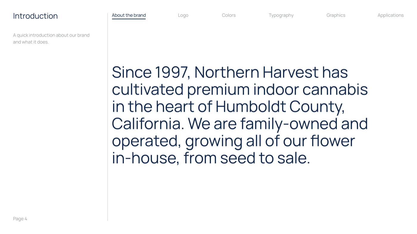
Northern Harvest grows some of the best cannabis in California. Humboldt County, where the brand was born, is the origin point of American cannabis culture. The soil, the climate, the generational knowledge of the growers who work it. This is a heritage operation that had never been given a brand to match what was inside the bag.
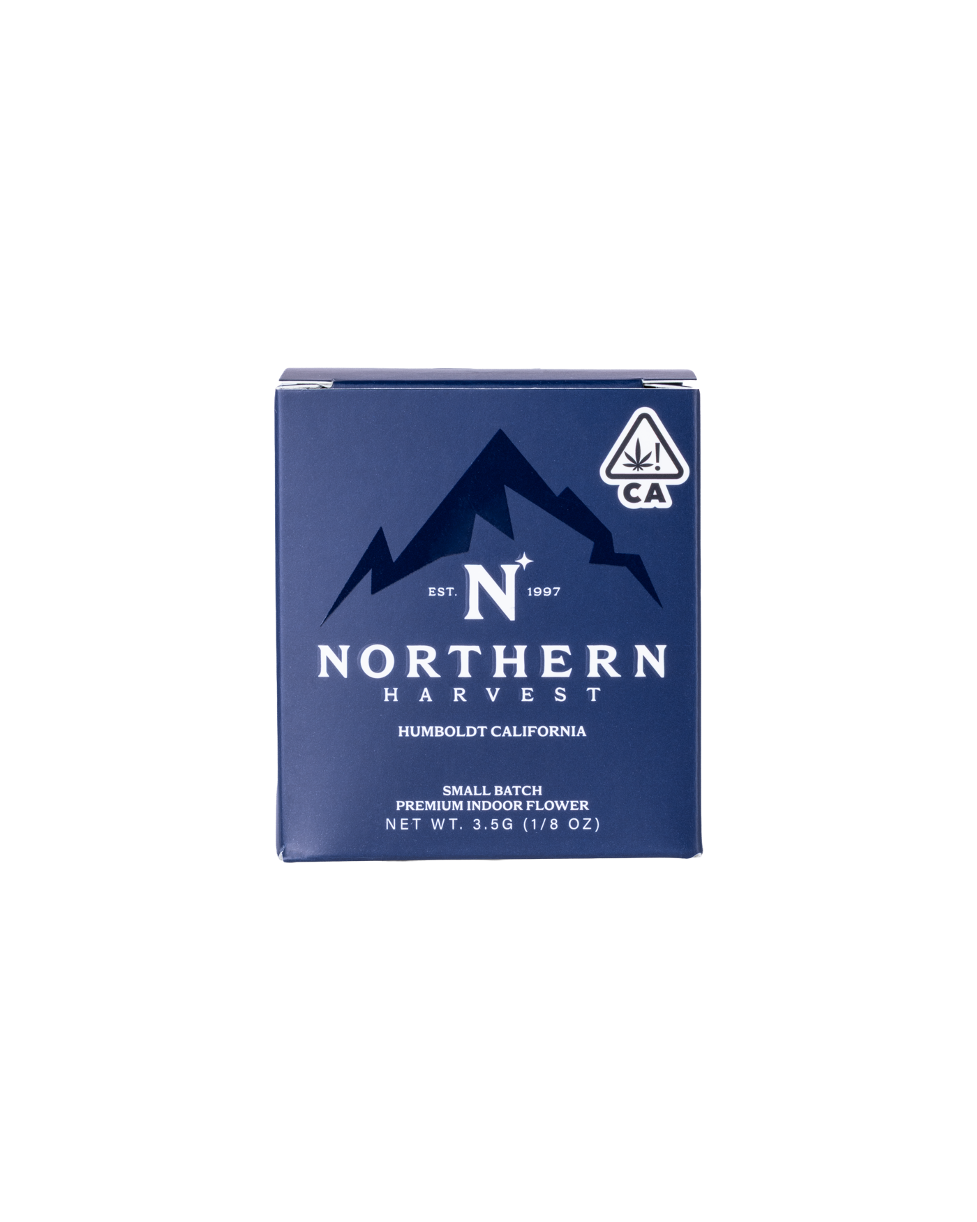
When I arrived in December 2025, Northern Harvest had one thing going for it: the flower. Their distributor placed them in 250+ dispensaries across California. The product moved. But the brand was invisible. No guidelines, no system, no story being told. The packaging looked like every other brand on the shelf. The sales team walked into dispensaries with nothing in their hands.
The founder, JT Weigman, had been under pressure from the distributor to professionalize the brand. Their feedback was direct and unambiguous. The product quality demanded premium positioning. Everything else needed to catch up.
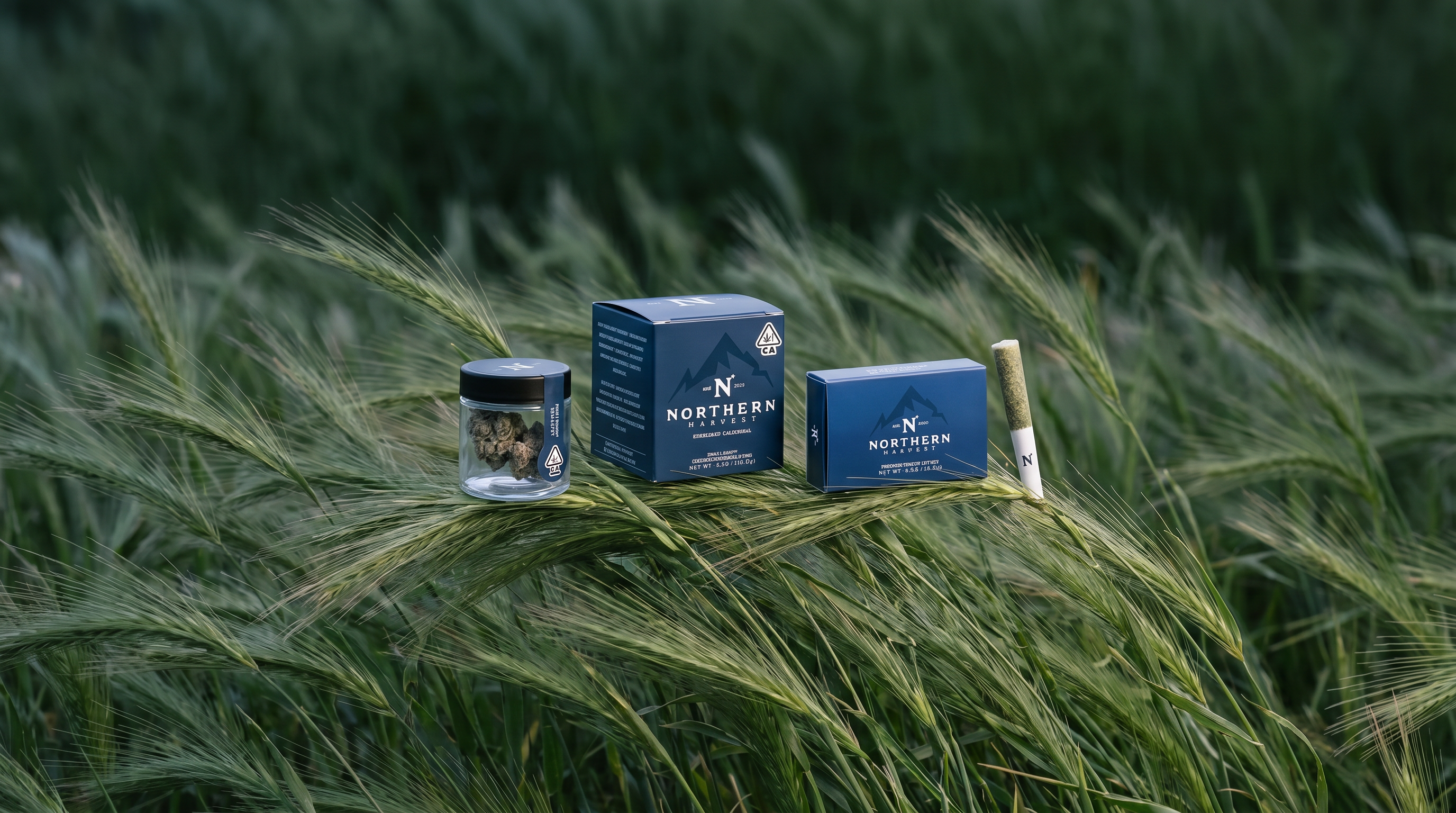
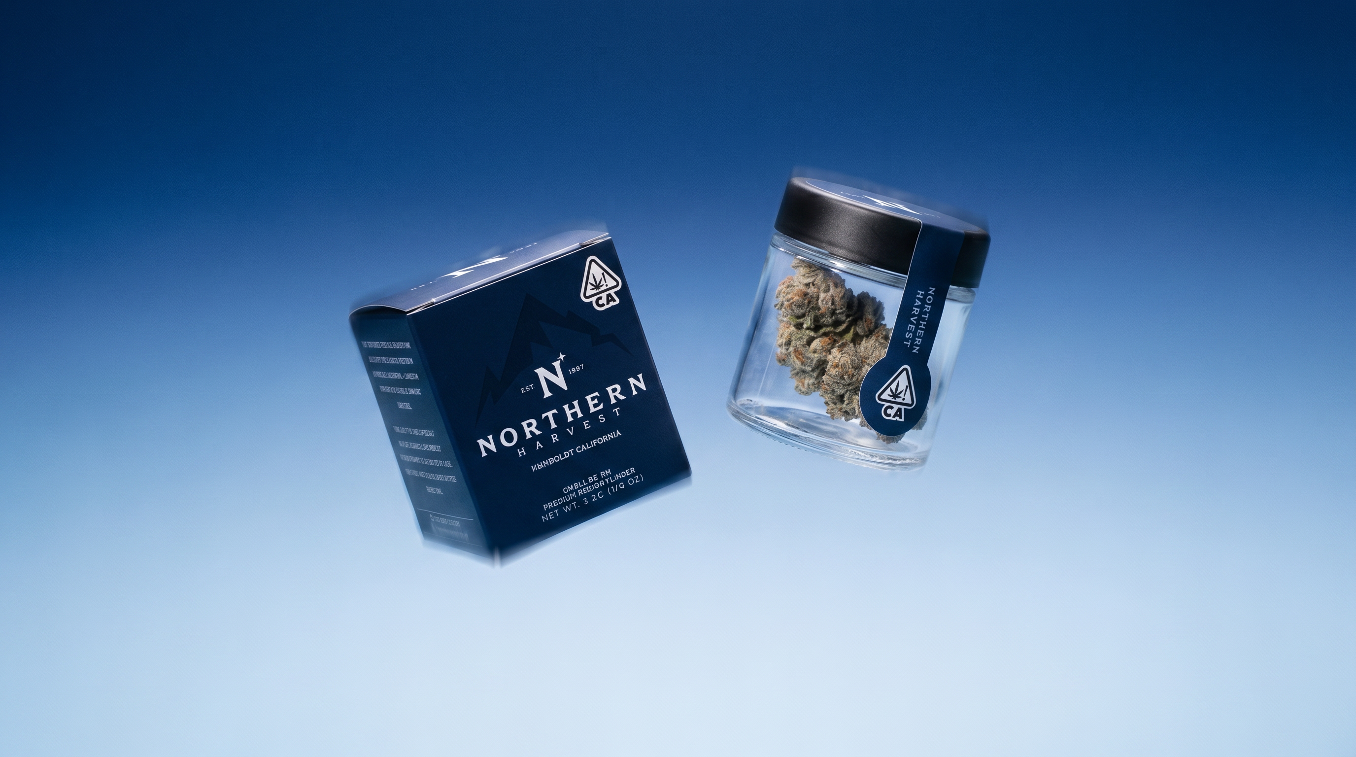
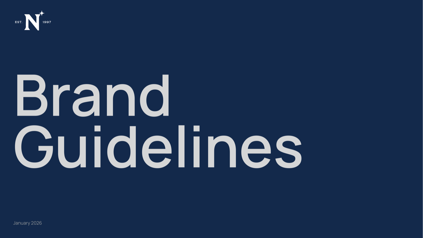
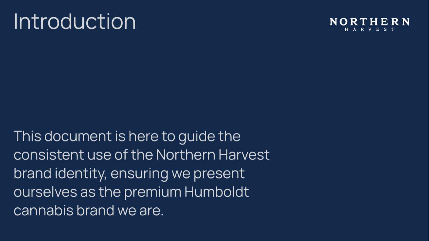
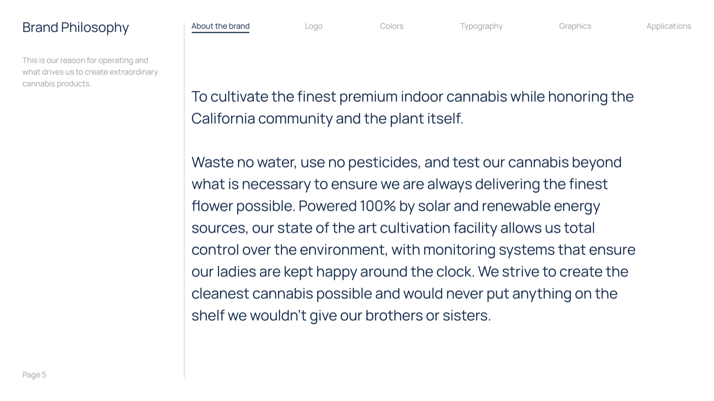
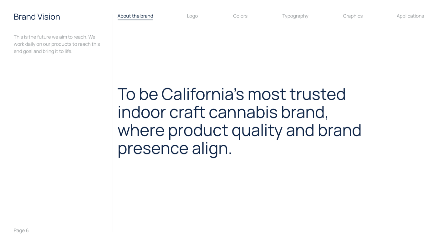
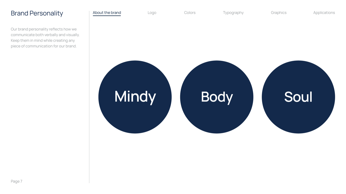
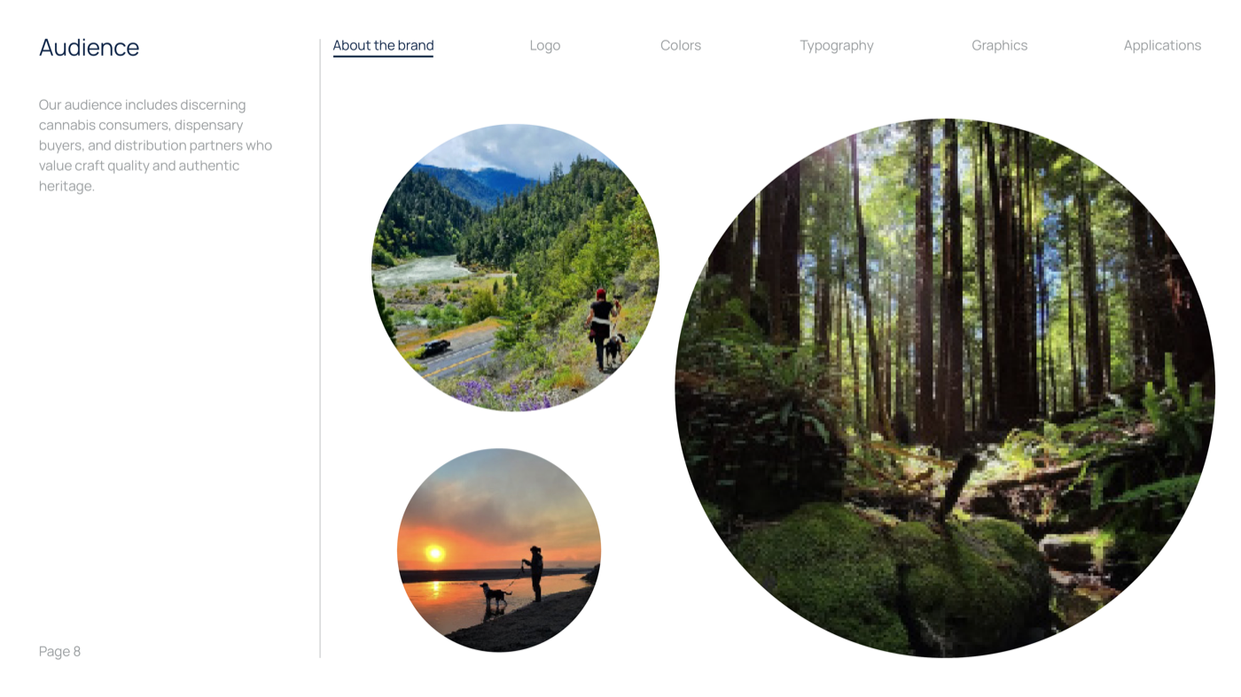
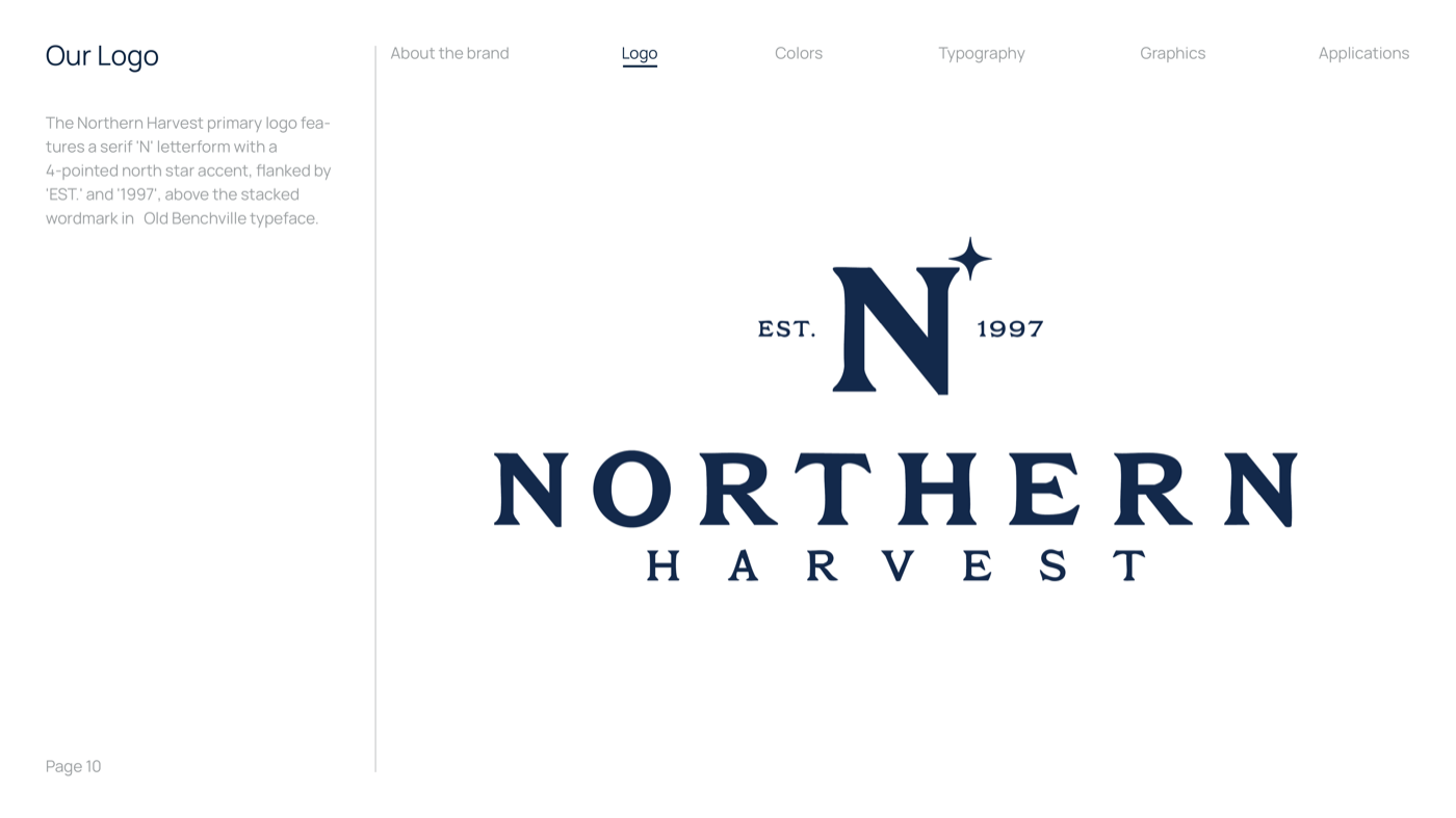
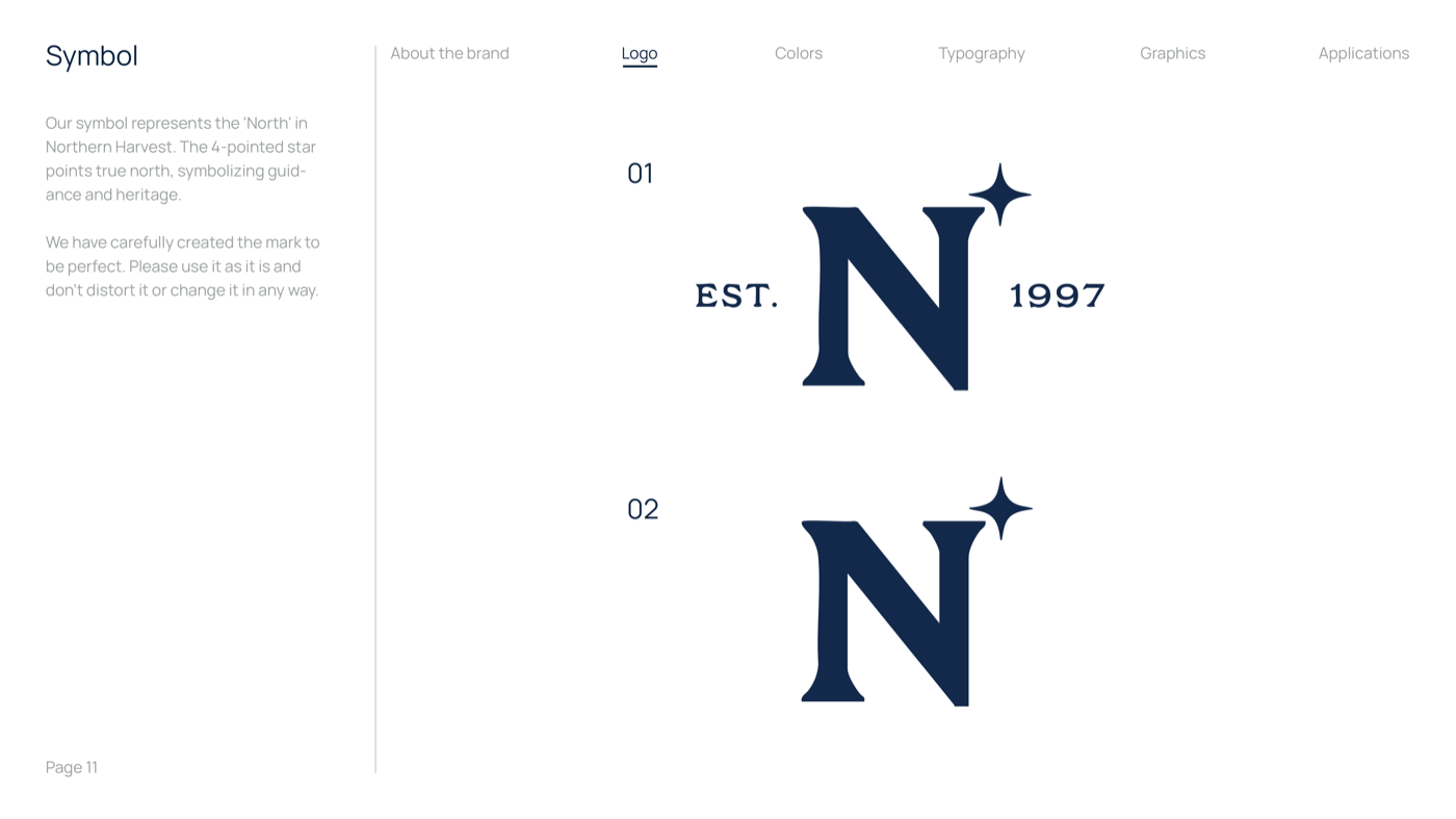
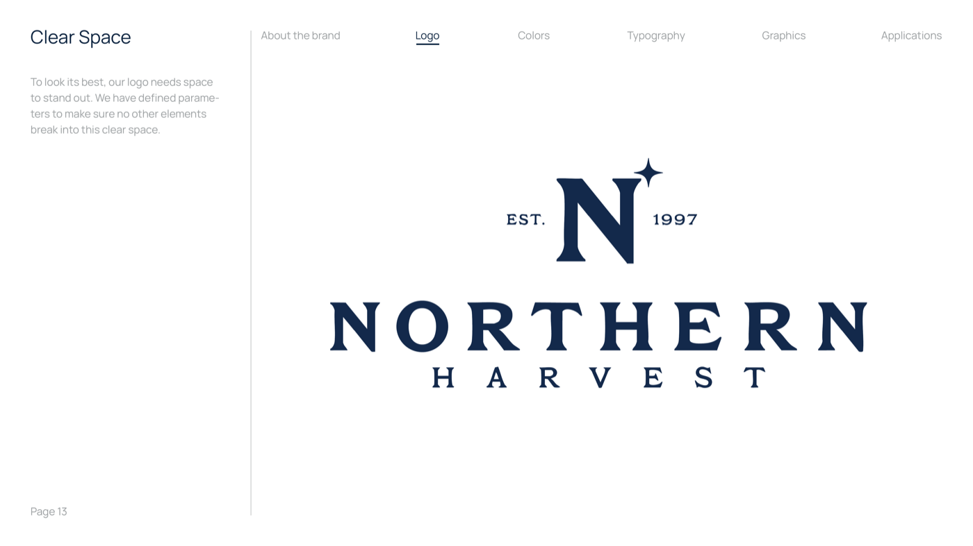
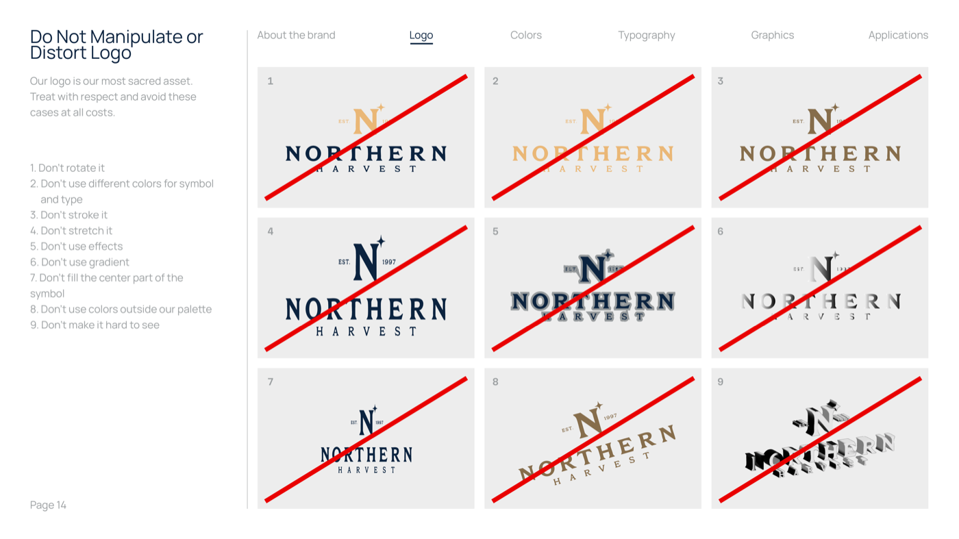
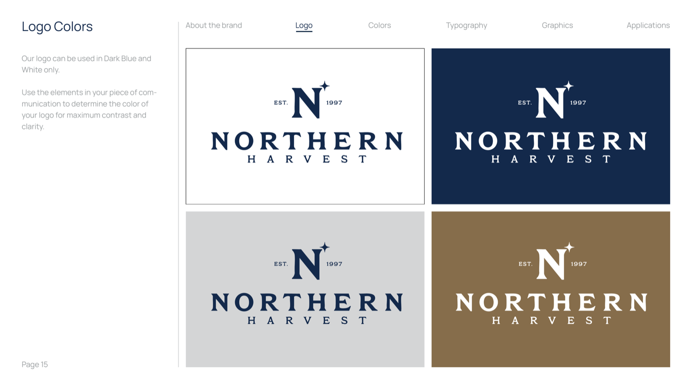
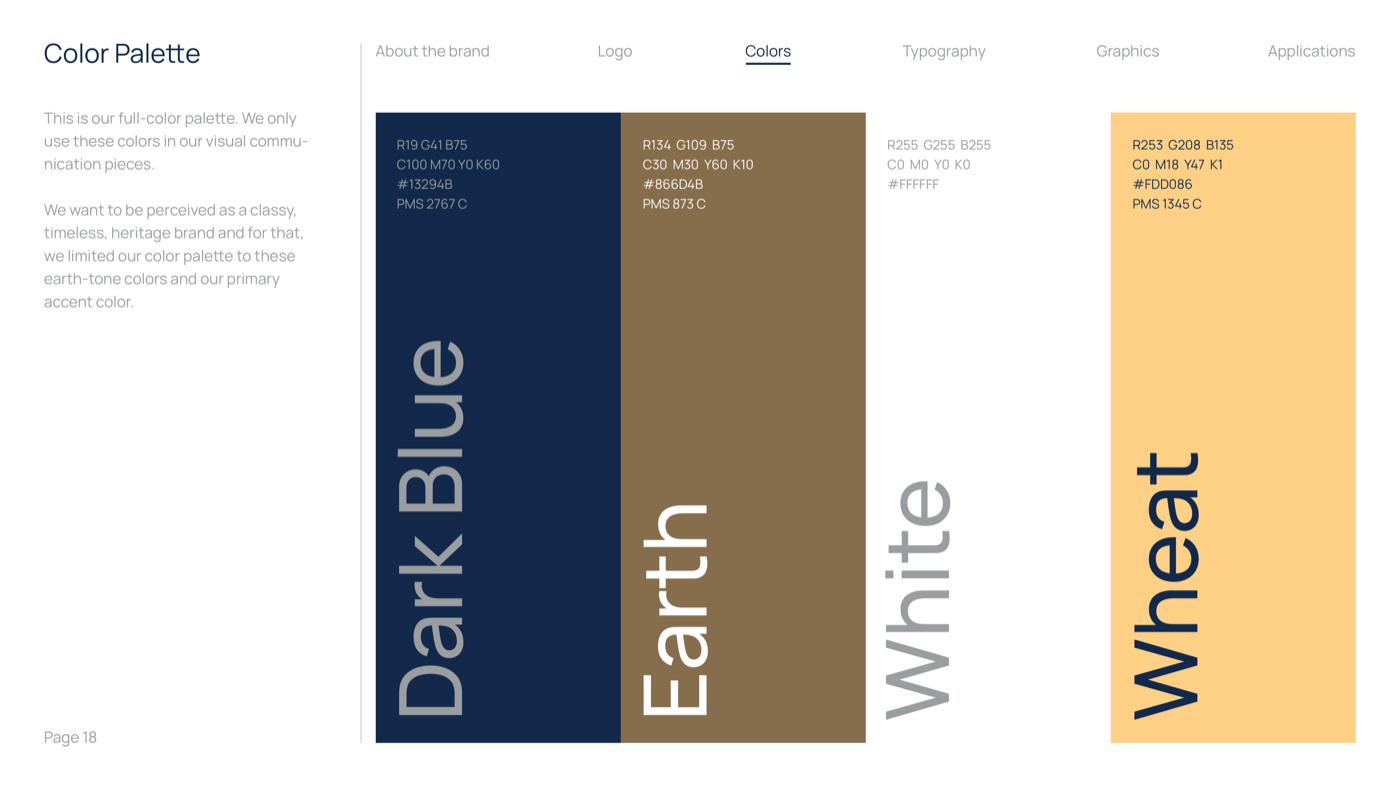
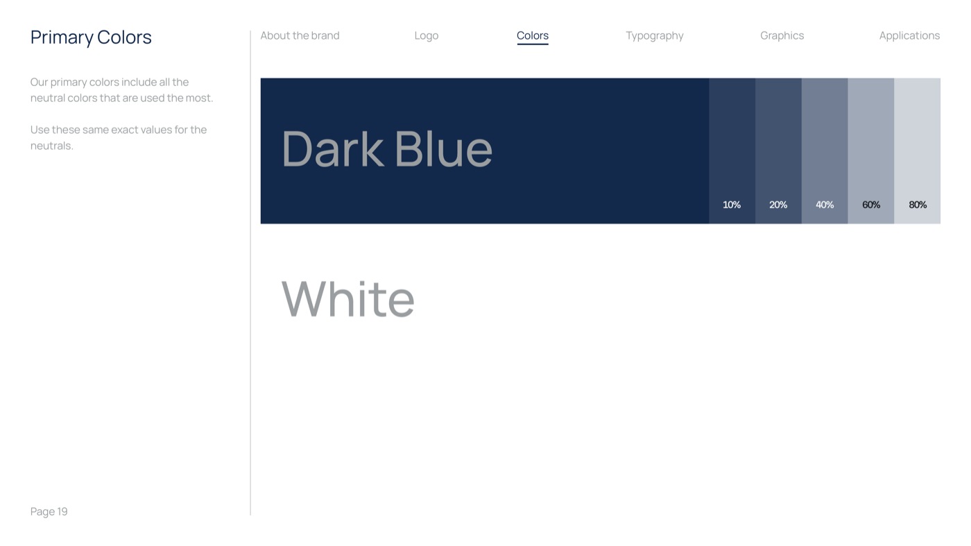
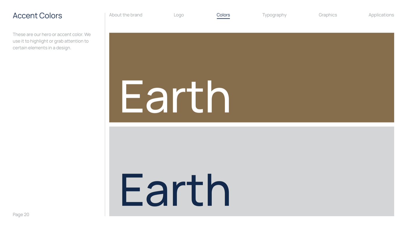
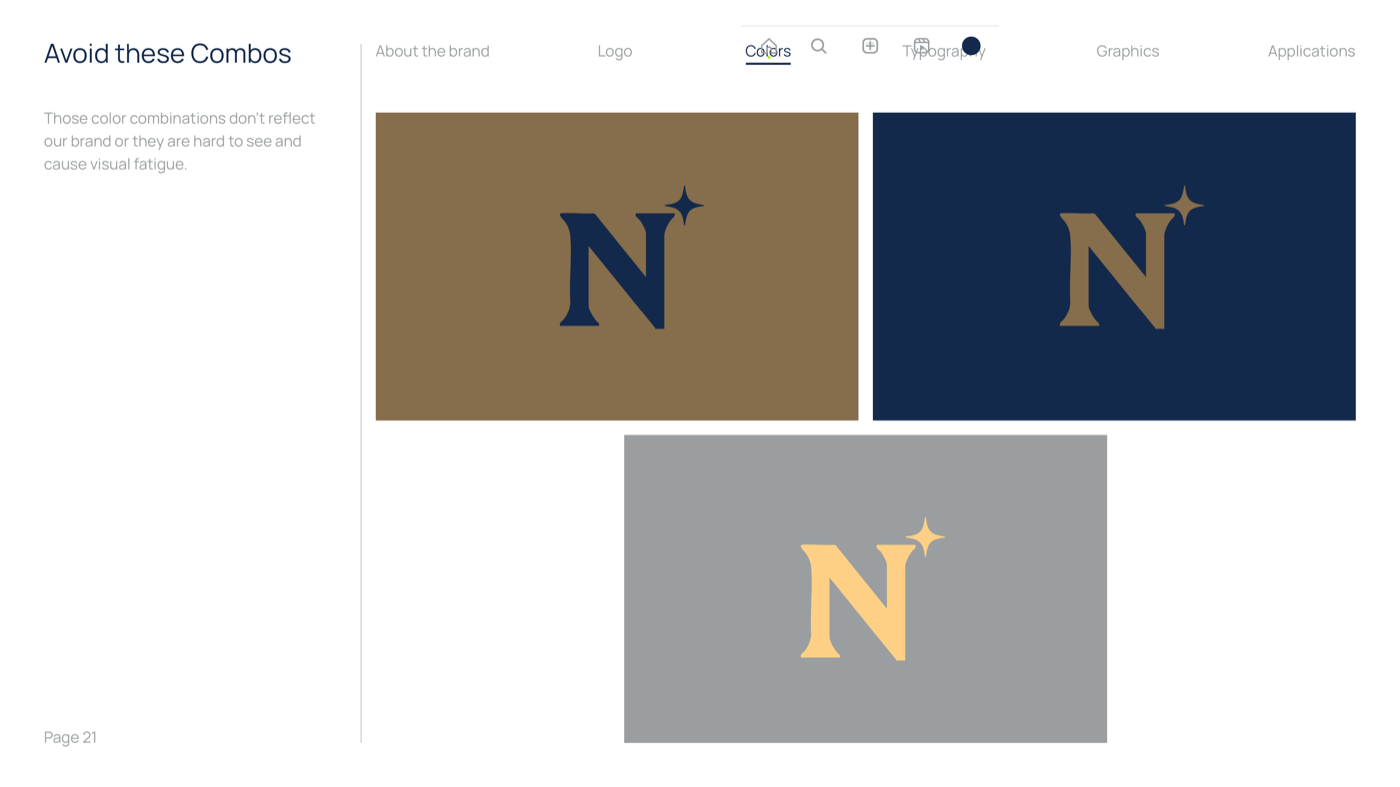
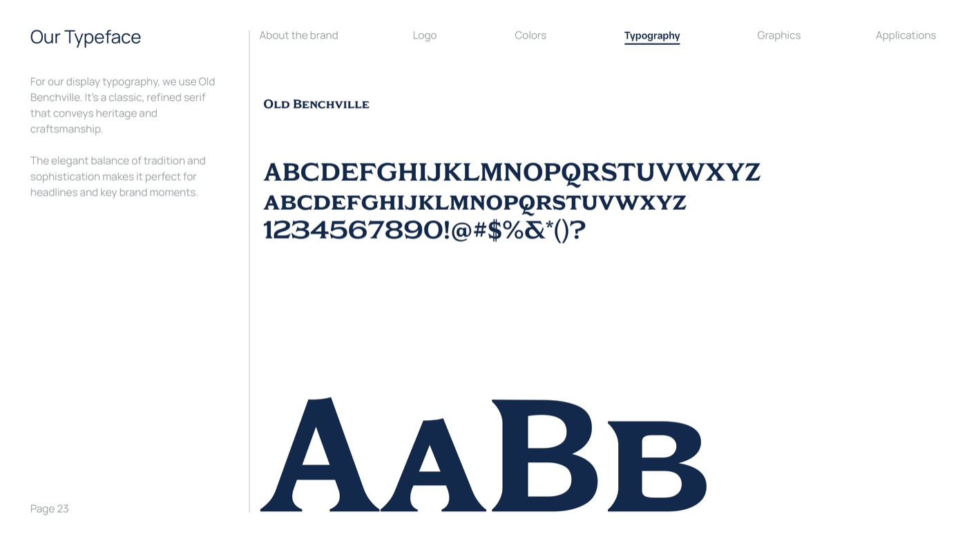
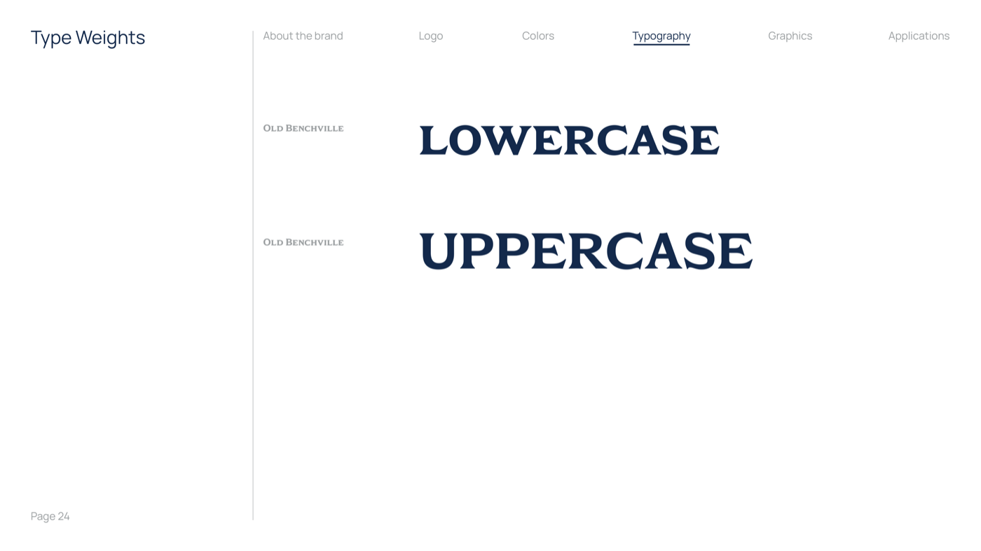
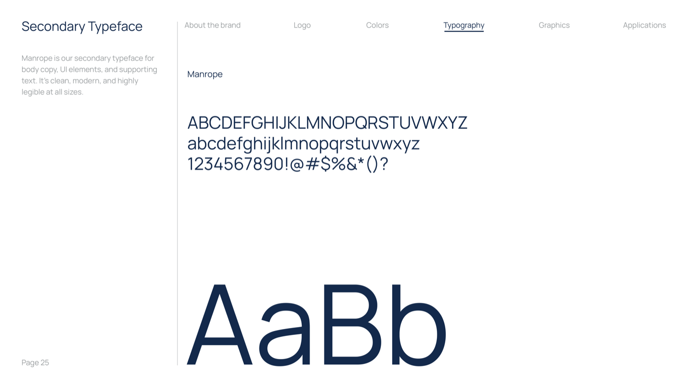
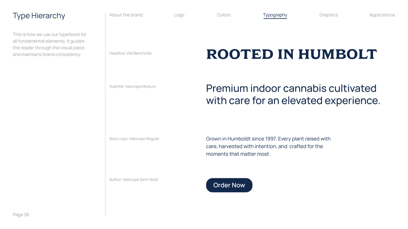
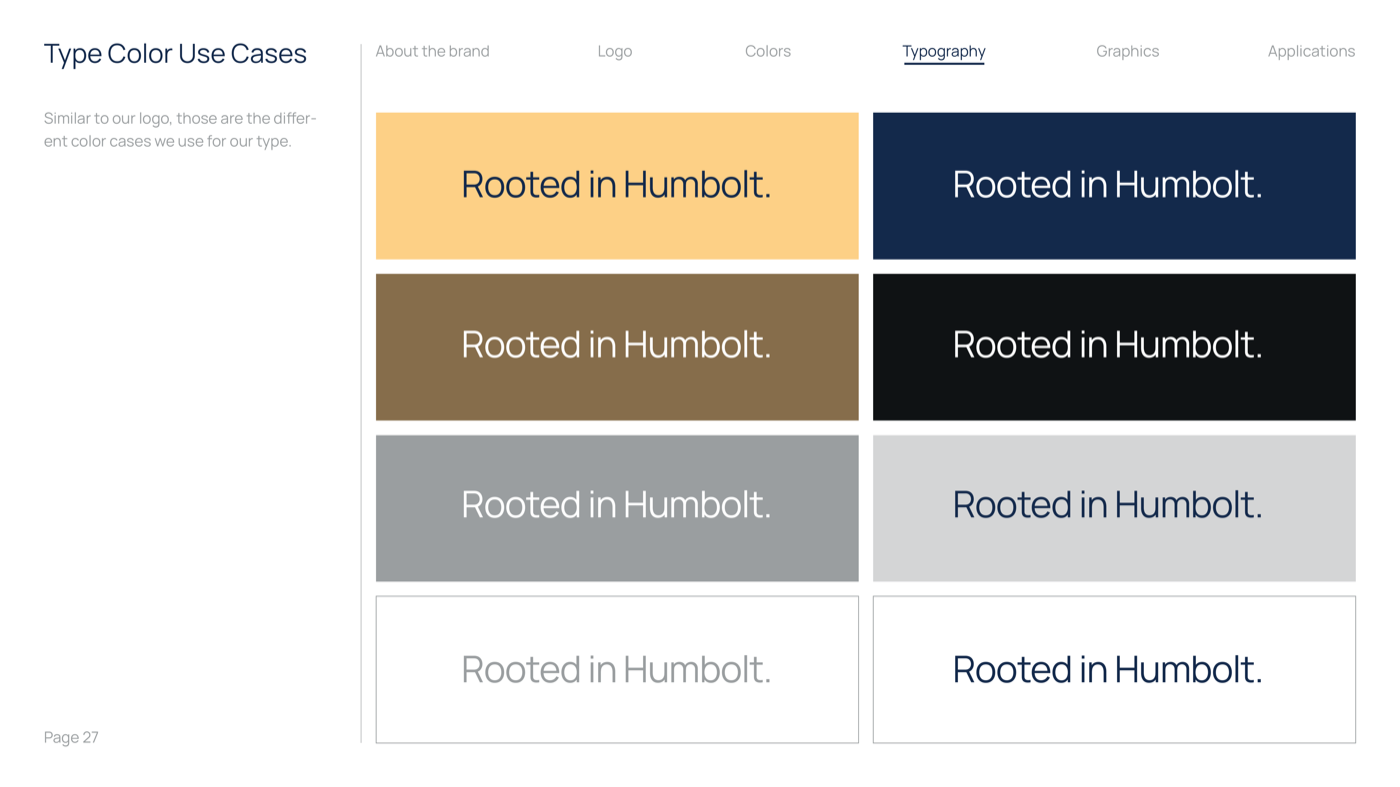
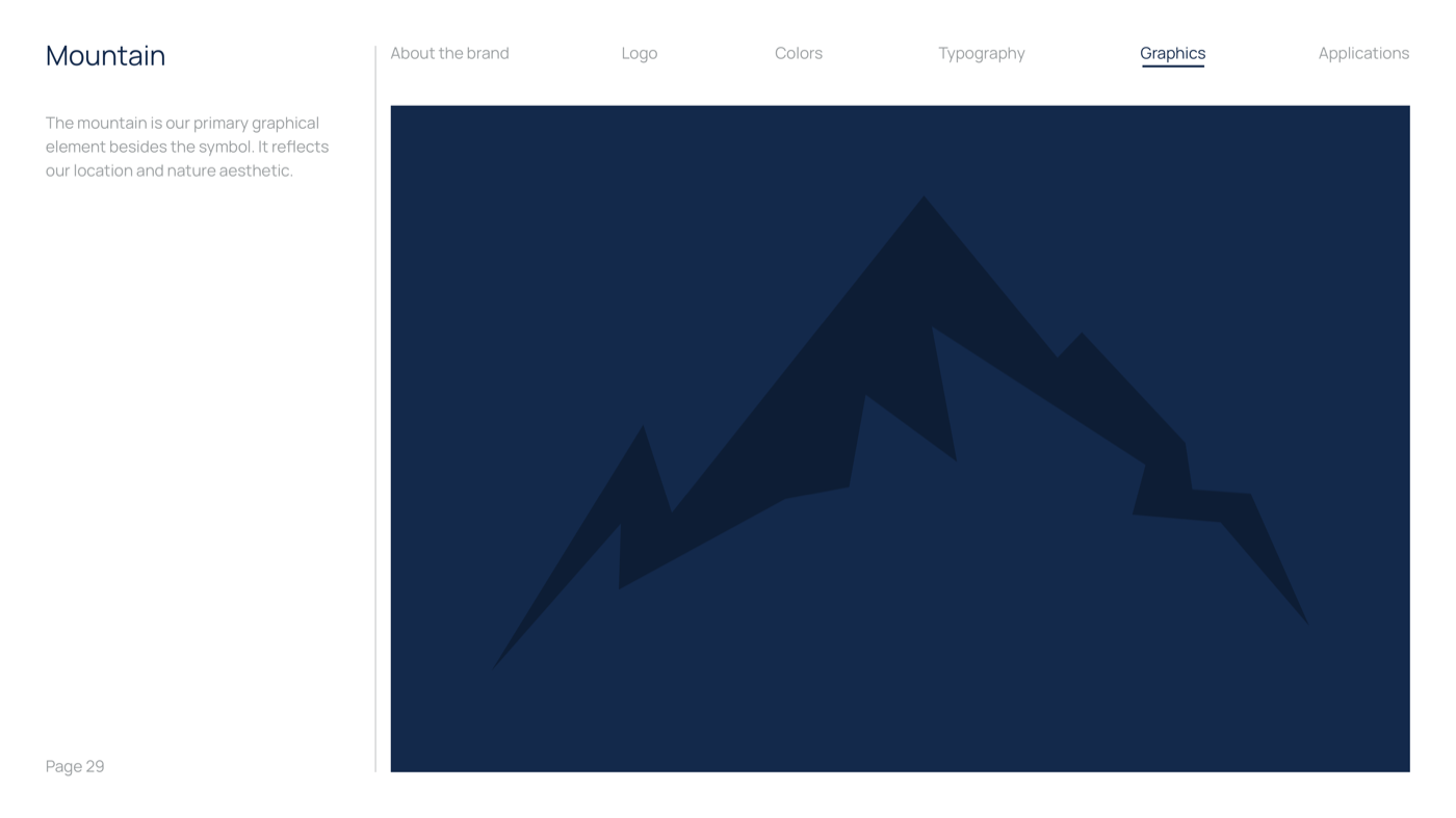
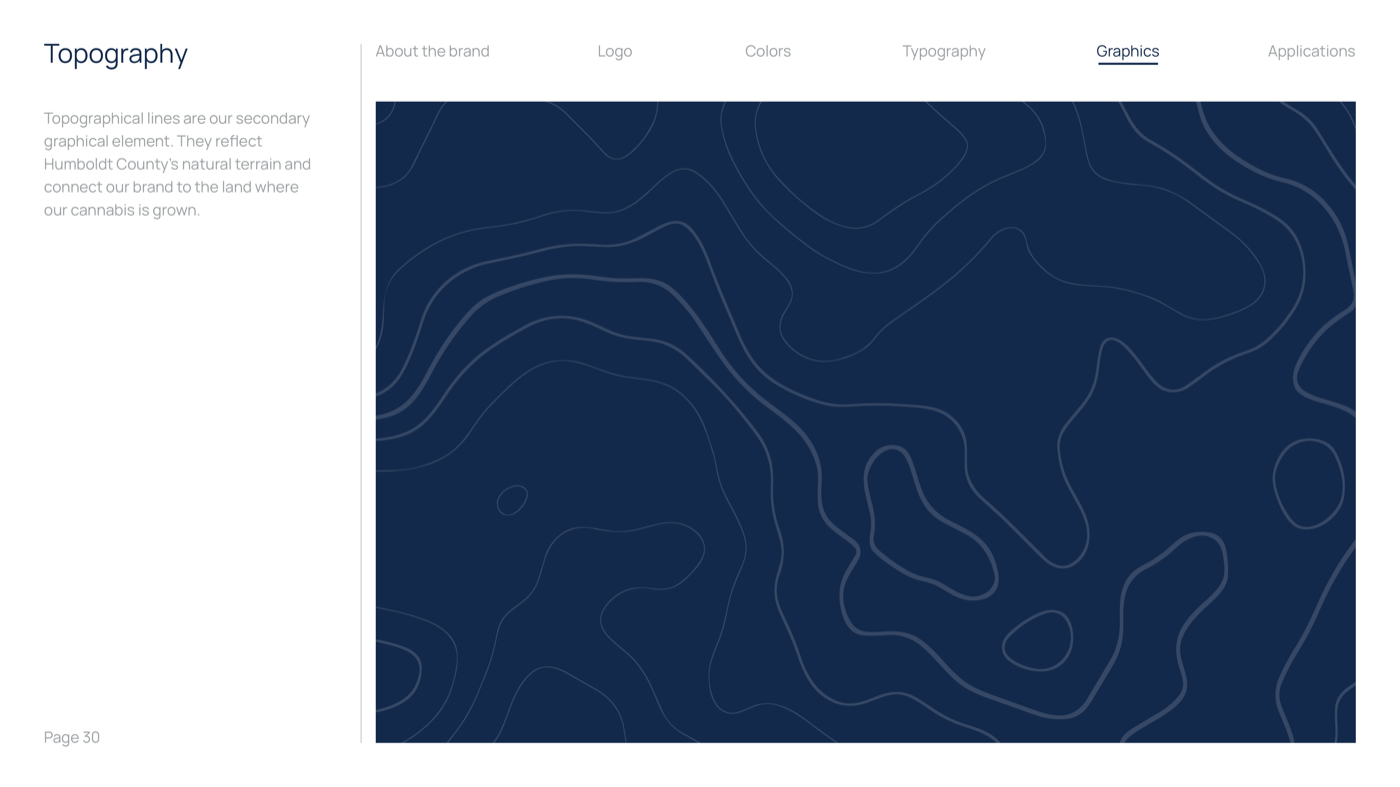
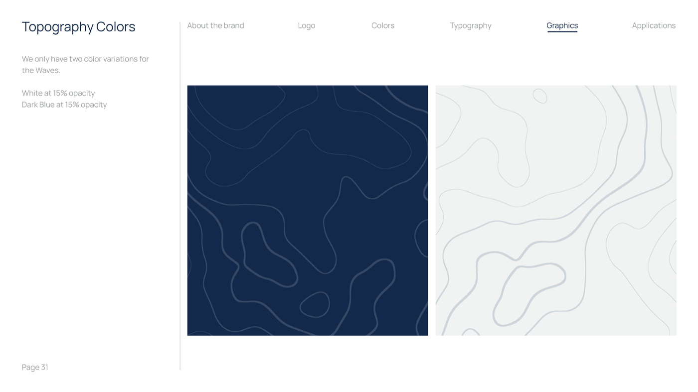
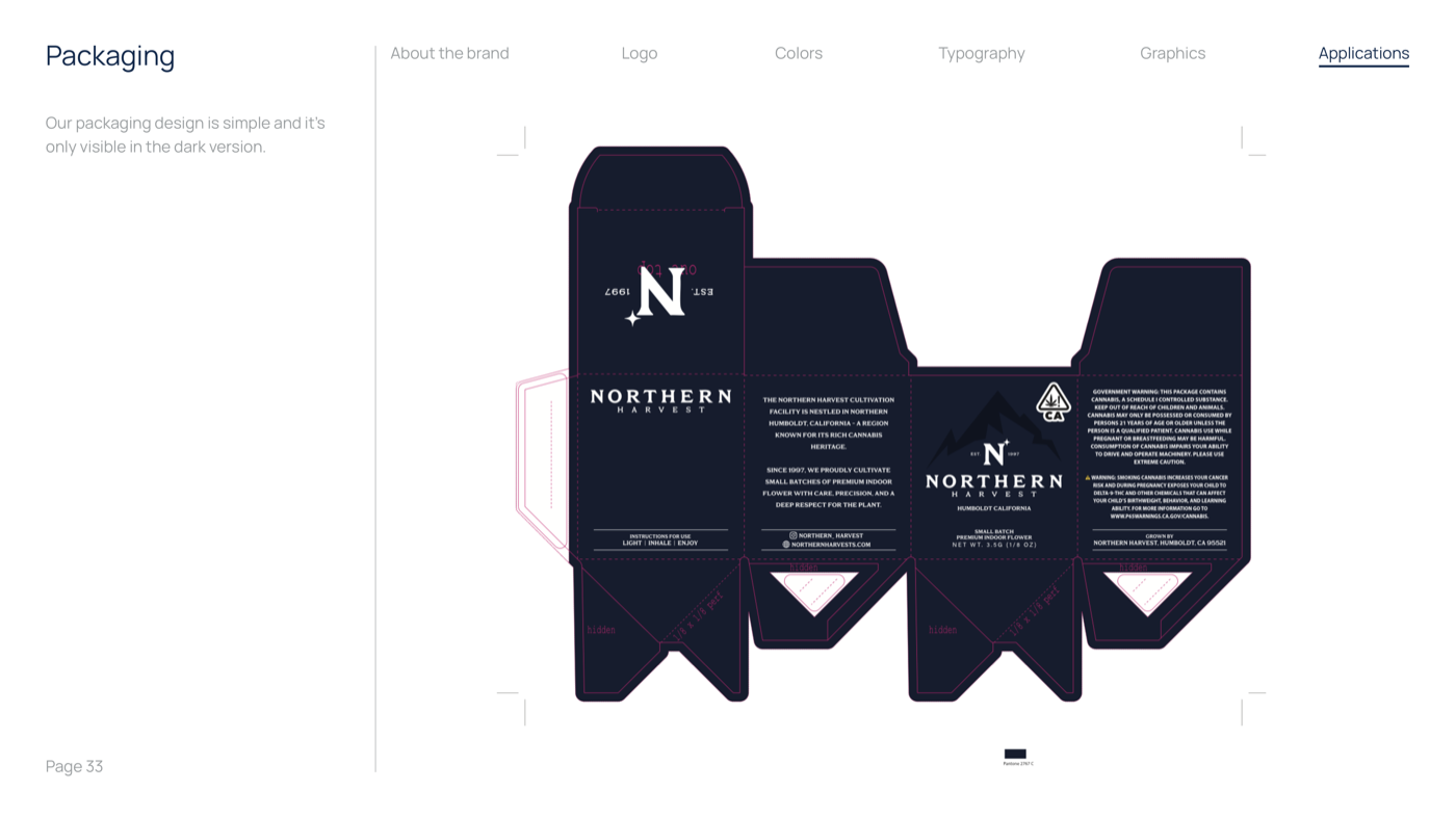
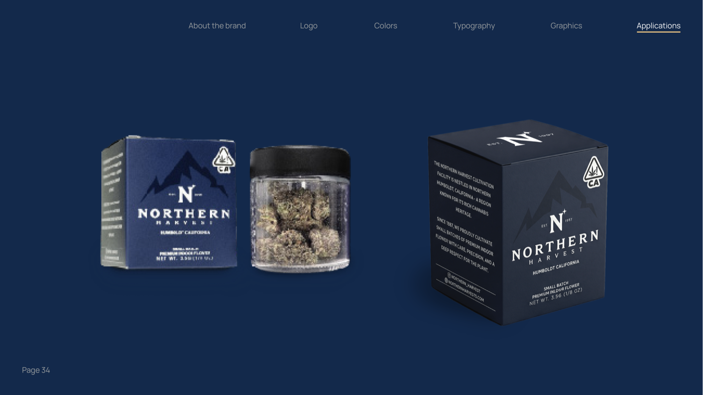
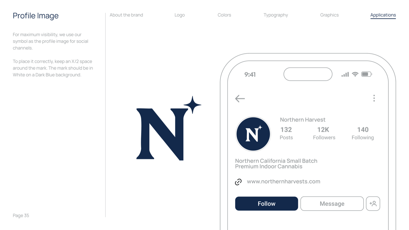
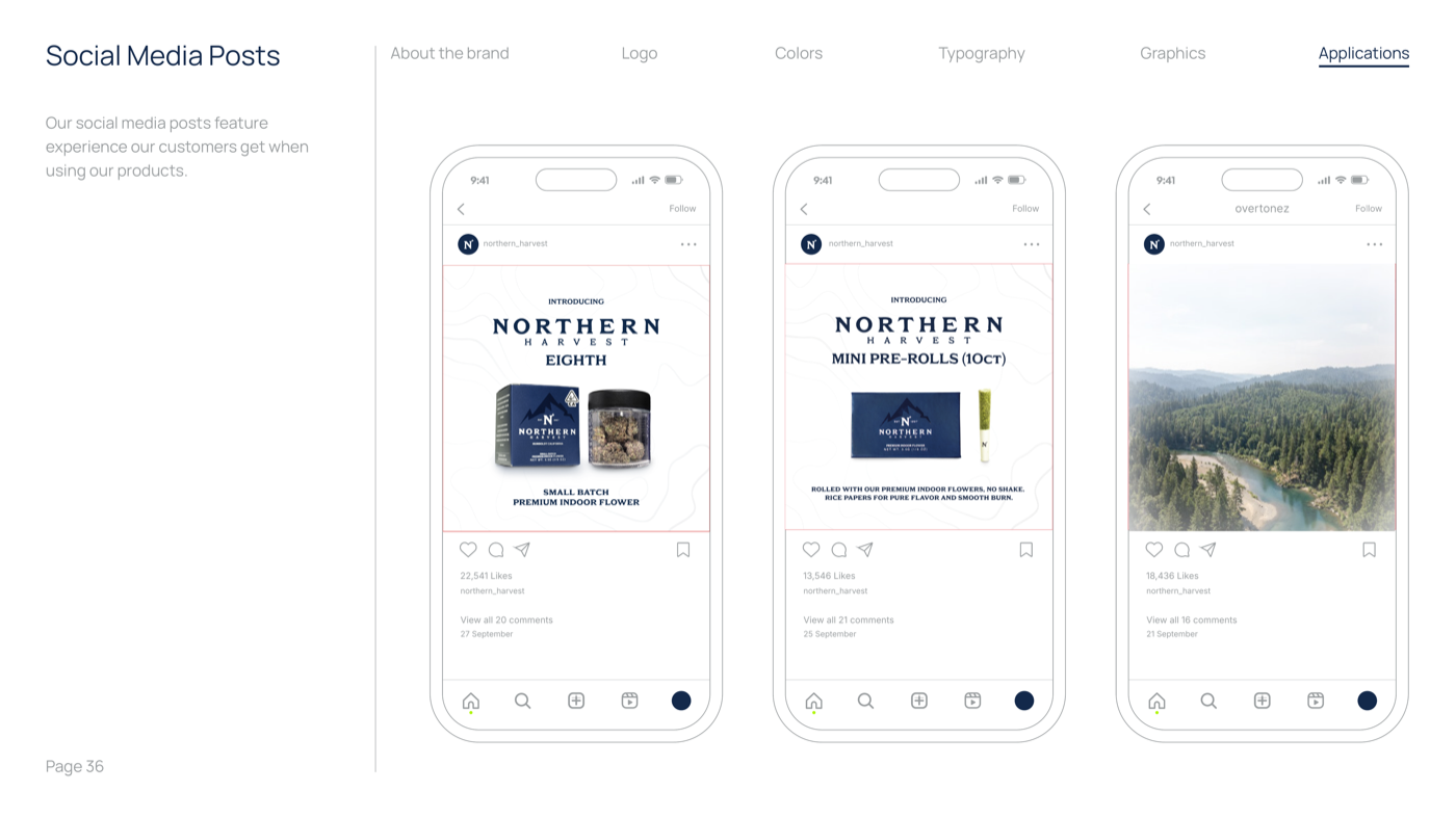
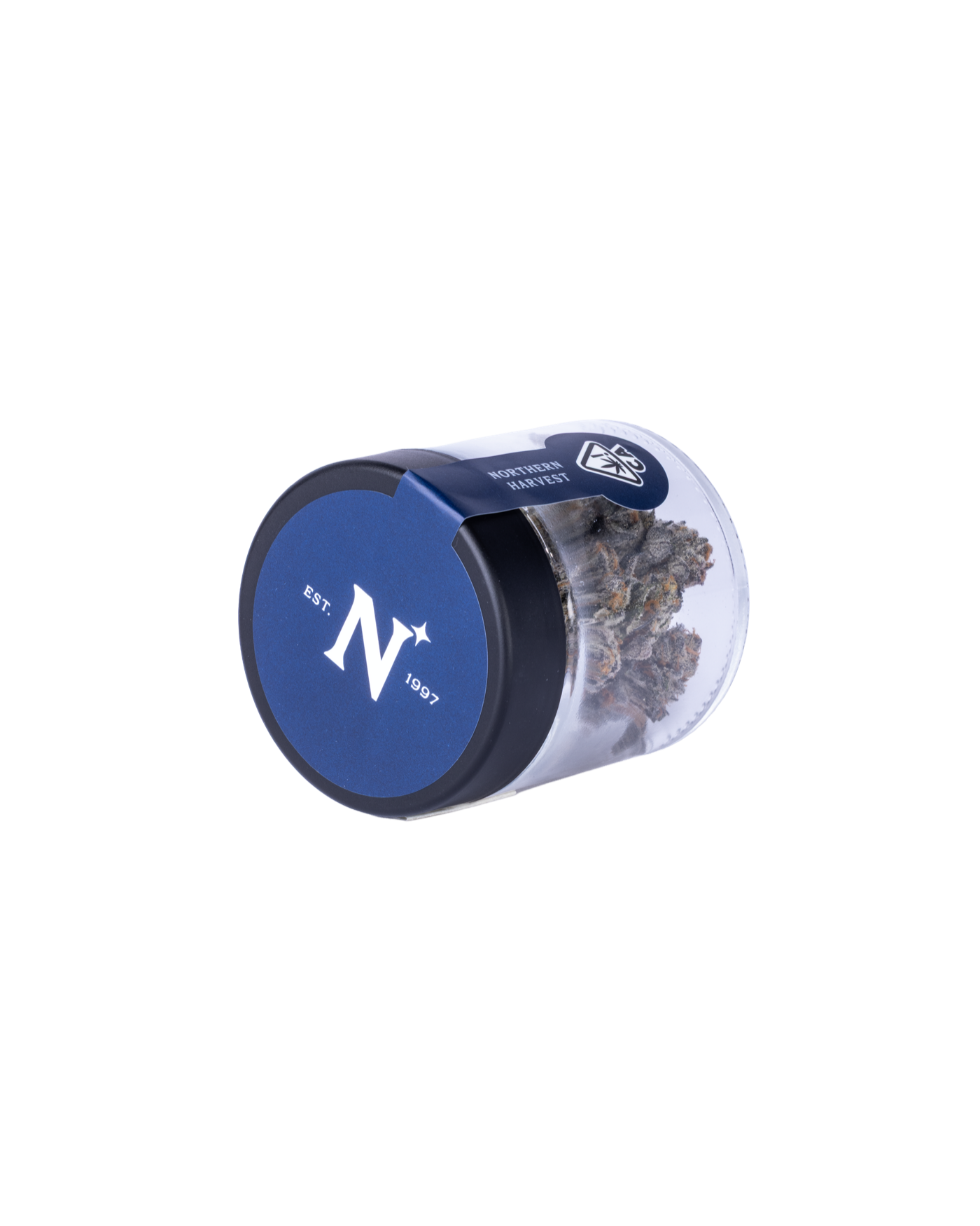
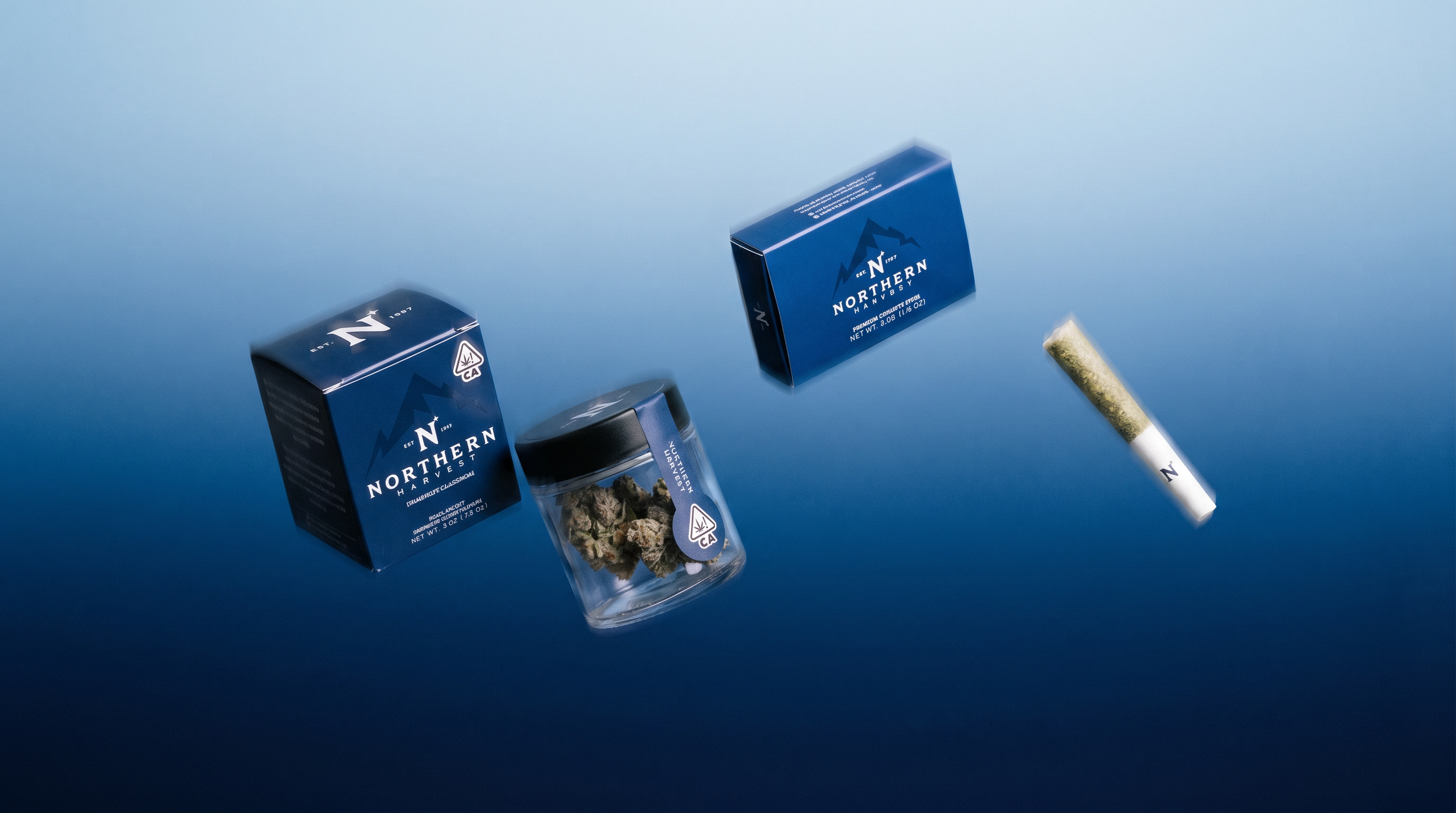
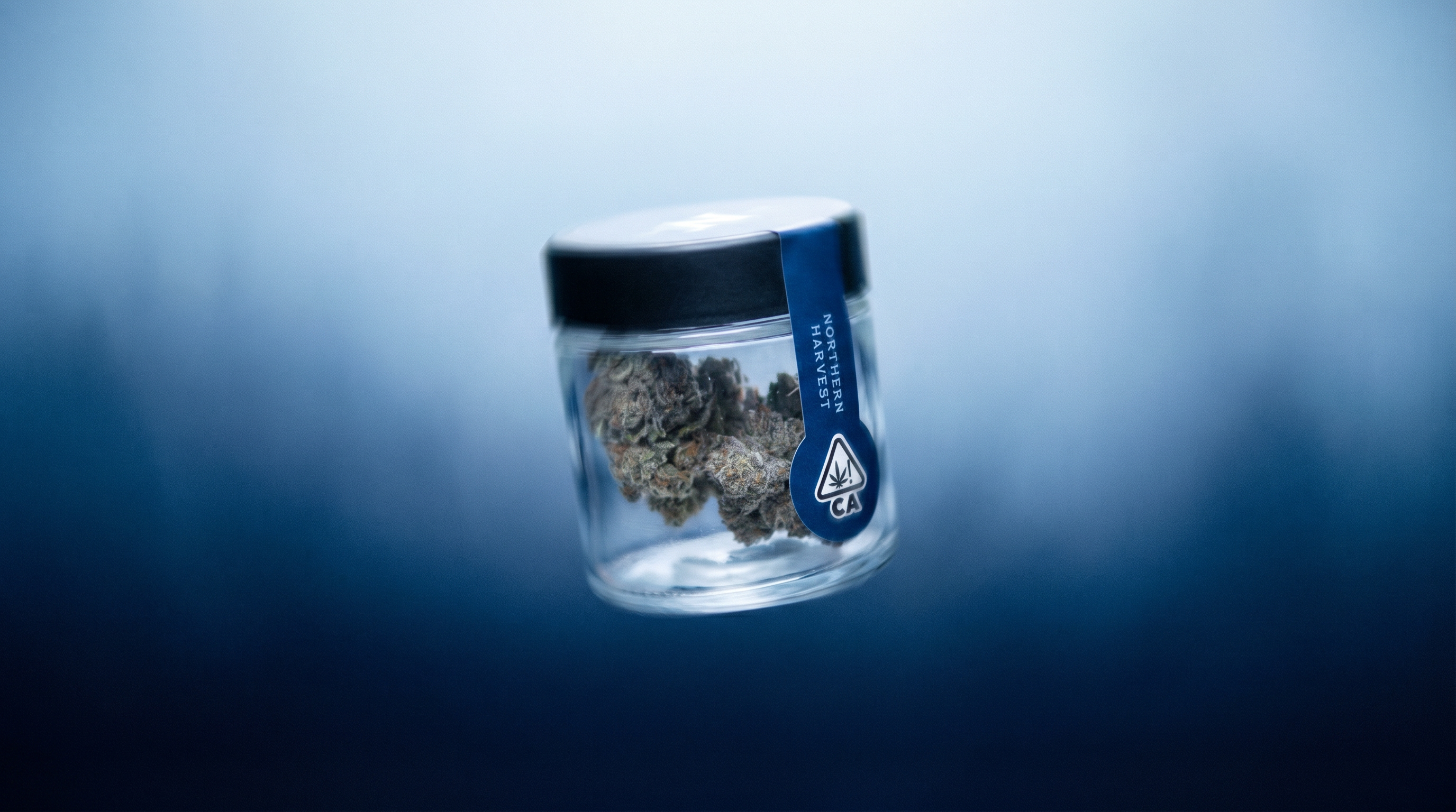
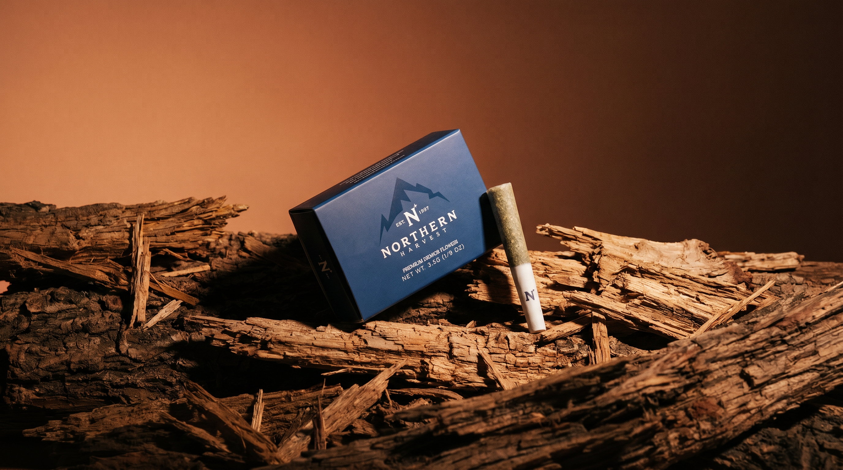
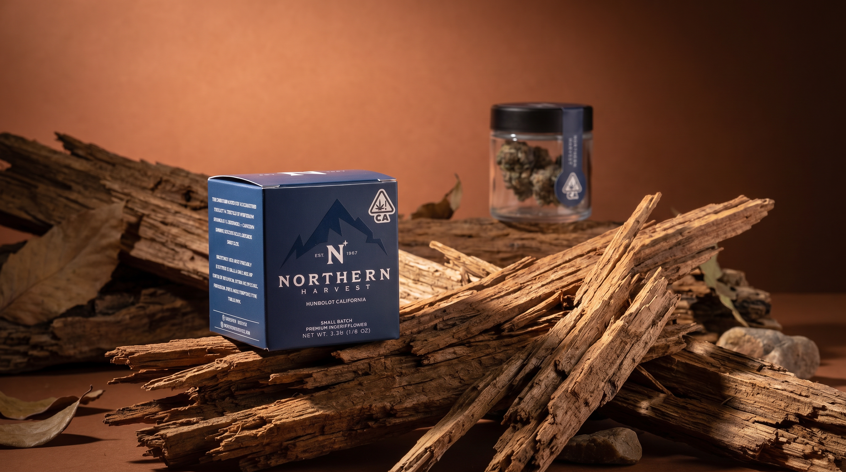
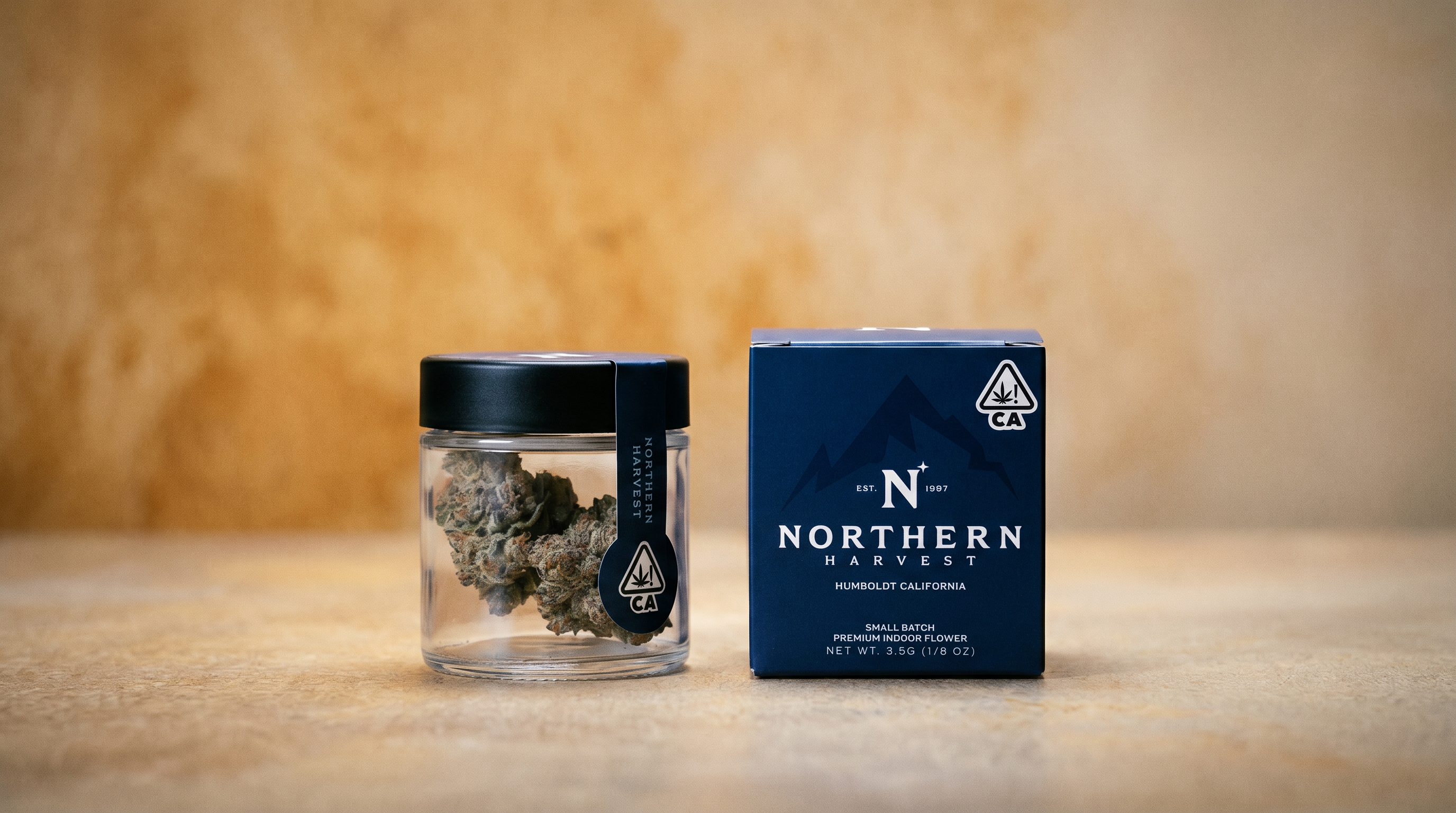
38-page brand guidelines document defining how Northern Harvest looks, speaks, and behaves. Typography, color, photography direction, packaging specs, and application rules. One system. Every touchpoint.
The brand system was designed to be understood by anyone who touches the brand, not just designers. Sales reps, distributors, retail partners. The guidelines read like a story about the brand.






Multi-page production website with strain detail pages, product catalog, Humboldt story, and dispensary locator. Concept to deployed, directly in code. No mockups. No handoffs. No translation loss. What I designed is what went live.
I build in the browser instead of in a mockup file. On a four-month build that mattered more than usual, because the layouts were tested against real strain data from the first week. When the catalog changed, nothing had to be redrawn.


View live site: northernharvests.com
| Before | After |
|---|---|
| No brand guidelines | 38-page brand system with typography, color, photography, and packaging specs |
| No sales collateral | Menus, postcards, sell sheets, and tent cards in 250+ dispensaries |
| No website | Production website with strain pages, product catalog, and dispensary locator |
| No content pipeline | Active content strategy with photography direction and seasonal campaigns |
| Distributor flagging brand gap | Distributor now uses the materials as its benchmark with other clients |
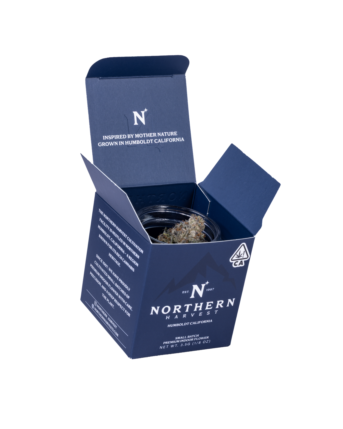
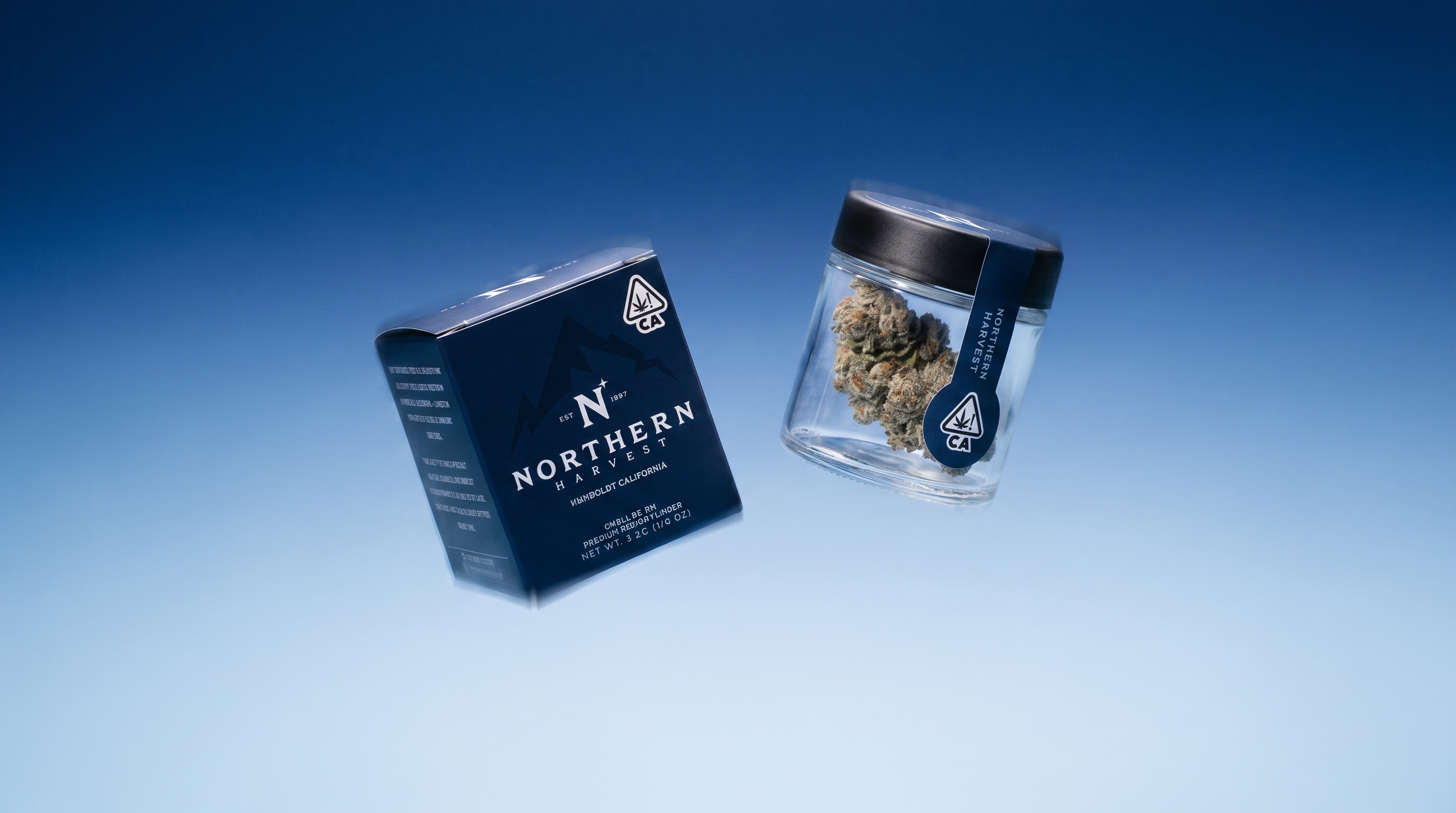
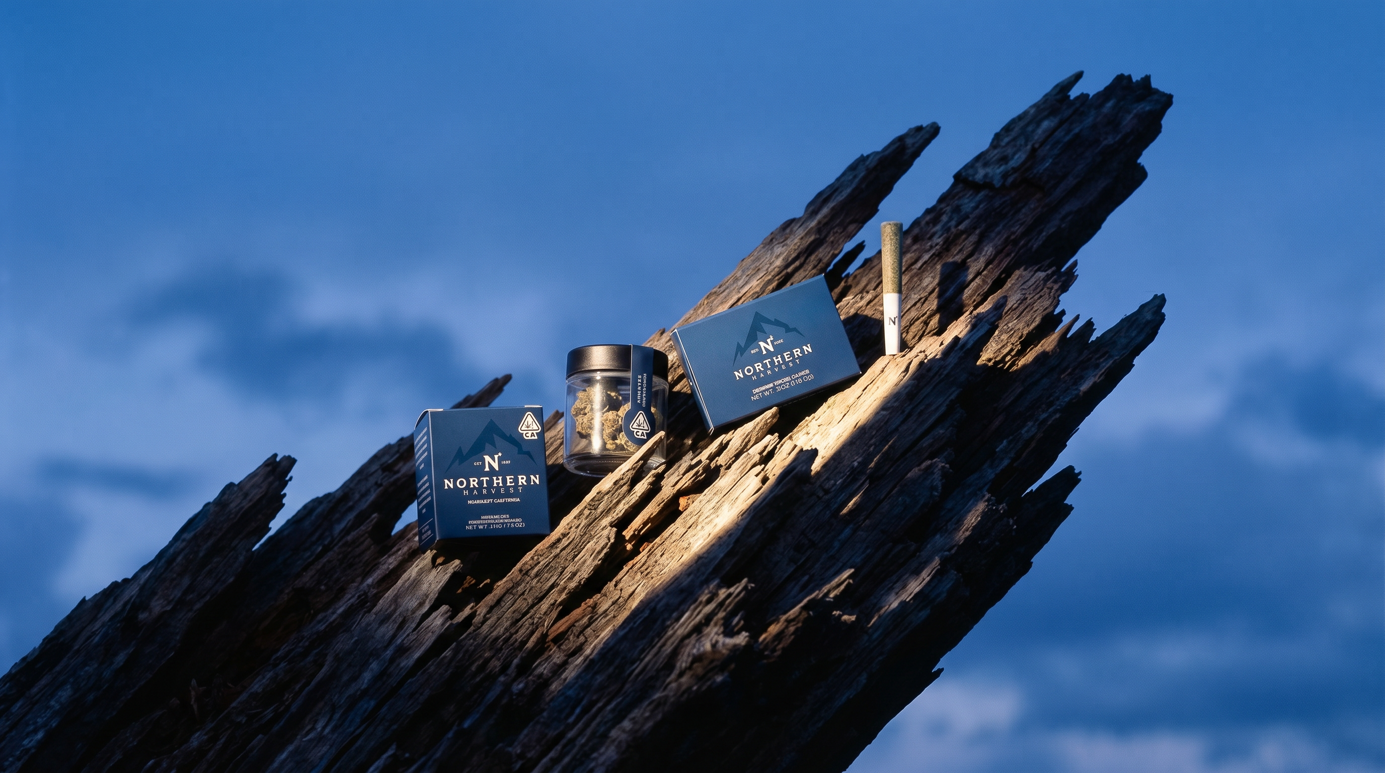
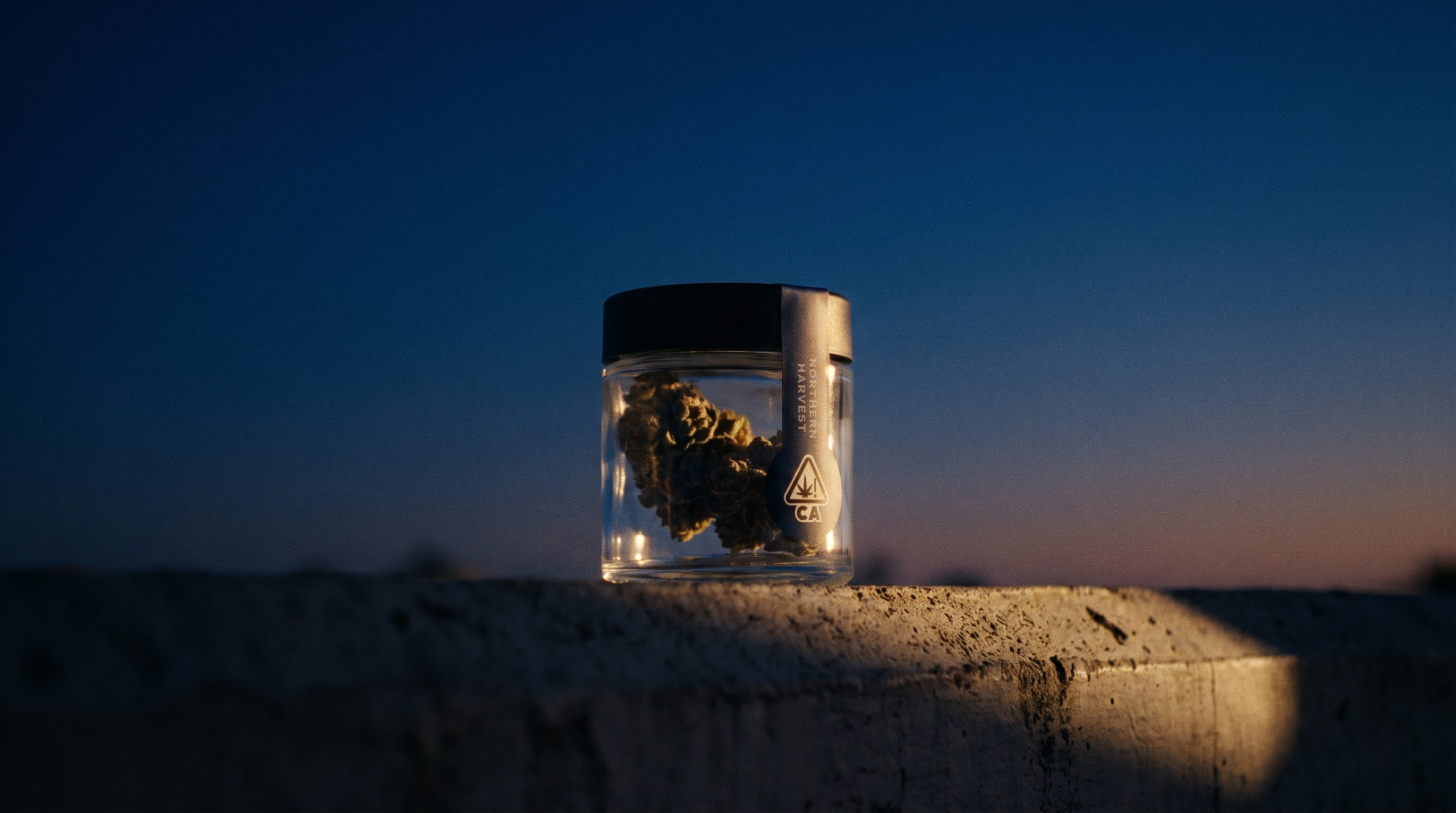
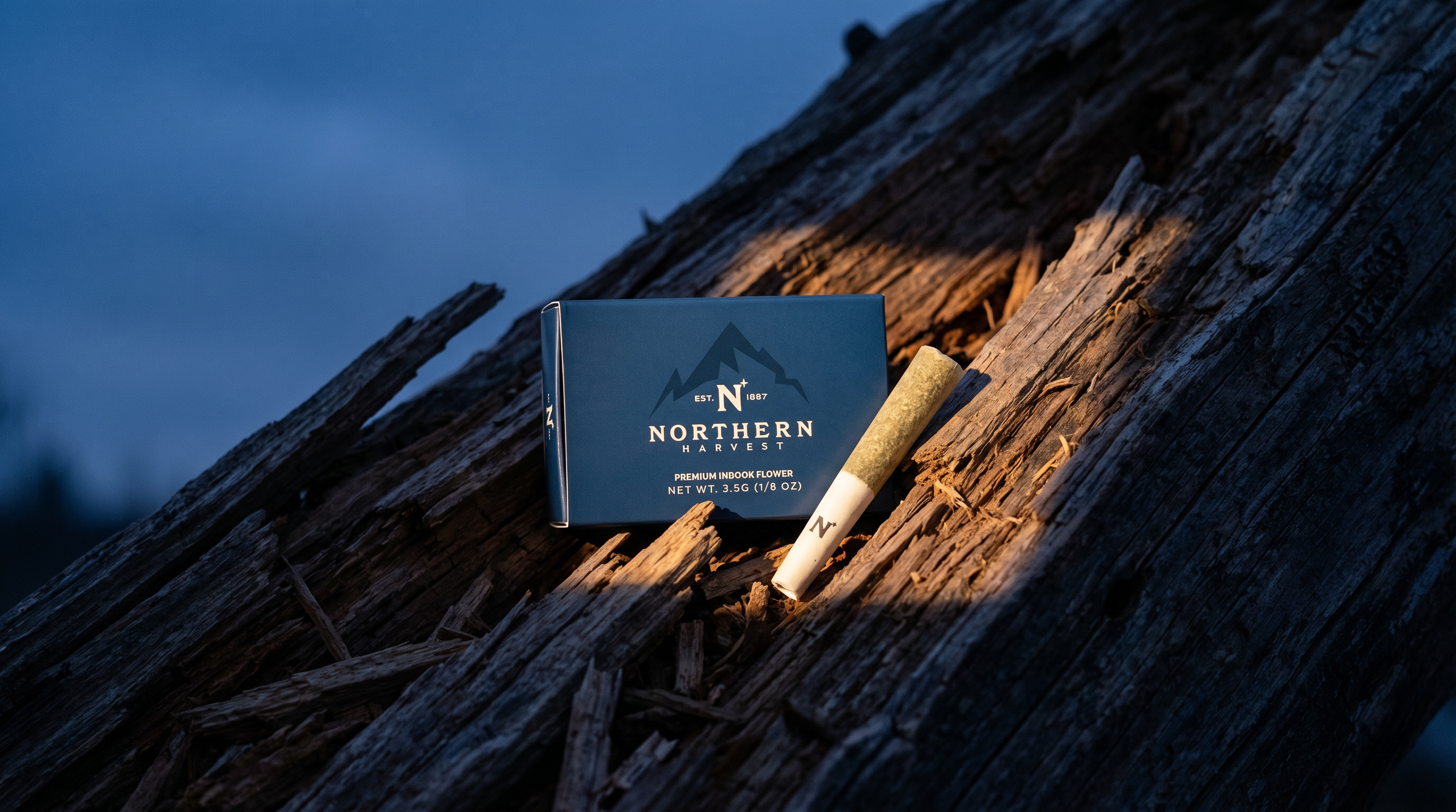
With more time, I would have pushed for a professional photography shoot before building the website. The product deserves it. What surprised me is how much the Million Dollar Test simplified decision-making. One filter eliminated hours of debate. When every stakeholder is aligned on a single question, the work moves faster than any process framework.
The project is ongoing and the brand is still evolving. The foundation is built.